 DRAG
DRAG
 DRAG
DRAG
 VcarePort
VcarePort
VcarePort
Quick access to essential system features, including the dashboard for an overview of operations, network settings for managing connectivity, system logs for tracking activities.
789 Inner Lane, Holy park, California, USA


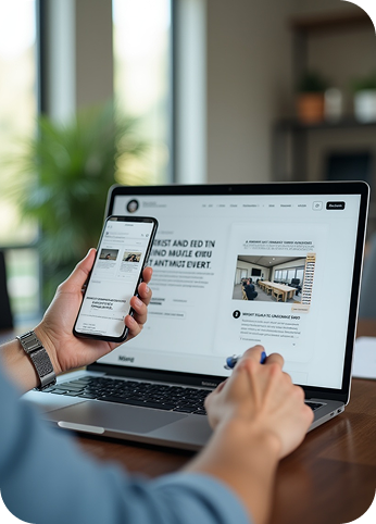
Responsive web design is an approach that ensures your website adapts seamlessly to different screen sizes and devices—whether it’s a smartphone, tablet, laptop, or desktop. It allows your content to resize, rearrange, and display perfectly, providing users with a consistent and optimal experience everywhere.

At V Care Port, we design with flexibility in mind. We make sure your website delivers fast, clean, and user-friendly experiences across all devices. With mobile traffic now dominating the web, a responsive design isn’t optional—it’s essential. Our team combines strong design principles with technical expertise to ensure your site looks professional and performs flawlessly at every screen size.
We design starting with the smallest screens in mind, ensuring essential content and functionality are prioritized for mobile users.
We use modern CSS frameworks and fluid grids to allow your site to adapt naturally to different screen sizes without breaking layout or readability.
We implement scalable fonts and responsive image techniques (like srcset or lazy loading) to maintain clarity and performance on all devices.
Menus, buttons, and interactive elements are designed for ease-of-use on touchscreens, reducing friction and improving mobile usability.


Responsive design ensures your website looks and functions well on all devices—phones, tablets, and desktops. It enhances user experience, increases mobile traffic engagement, and supports SEO.
Not exactly. A mobile website is a separate version built only for phones. Responsive design adapts your main site to all screen sizes using flexible layouts and styles—making it more efficient and future-proof.
No. With responsive design, there’s only one version of your site to maintain. It adjusts automatically across all screen sizes, simplifying updates and content management.
Yes. We can redesign or retrofit your existing website with responsive capabilities. In some cases, a full redesign is recommended for optimal performance.
When implemented correctly, responsive websites are optimized for speed on all devices. We use compressed images, clean code, and mobile-first practices to ensure fast load times.


